Plotting
Nanocompore's command line interface provides subcommands to easily generate plots. This page provides examples how to use this plotting interface. Alternatively, you can use the plotting module programatically in Python.
All plotting commands are executed with nanocompore plot <plot_type>. You can use the --help flag to get a description of all possible parameters that can be provided for the specific type of plot.
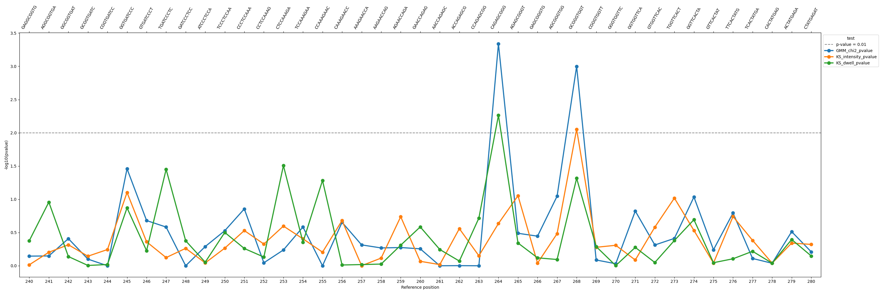
pvalues
Command: nanocompore plot pvalues
Plots p-values from a finished Nanocompore run over a region.
positional arguments:
  reference             Reference name, matching a name from the FASTA reference used in the config.

options:
  -h, --help            show this help message and exit
  --config CONFIG, -c CONFIG
                        Path to the input configuration YAML file.
  --output OUTPUT, -o OUTPUT
                        Path and filename where the plot will be saved.
  --start START         0-based index on the reference.
  --end END             0-based index on the reference.
  --threshold THRESHOLD
                        Threshold p-value that will be drawn as a line.
  --kind {lineplot,barplot}
                        Kind of plot to draw. Default: lineplot
  --figsize FIGSIZE     Figure size. Default: 30,10
  --tests TESTS         Which tests to plot. By default all executed tests are shown.
  --palette PALETTE     Color palette to use. Default: Dark2
Palettes can be picked from the standard matplotlib colormaps: https://matplotlib.org/stable/users/explain/colors/colormaps.html
Example plot:
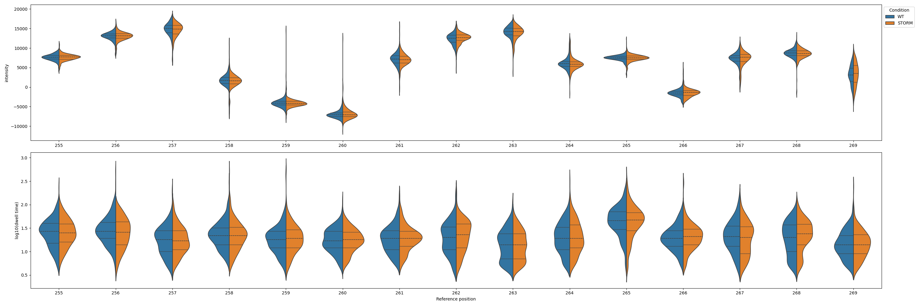
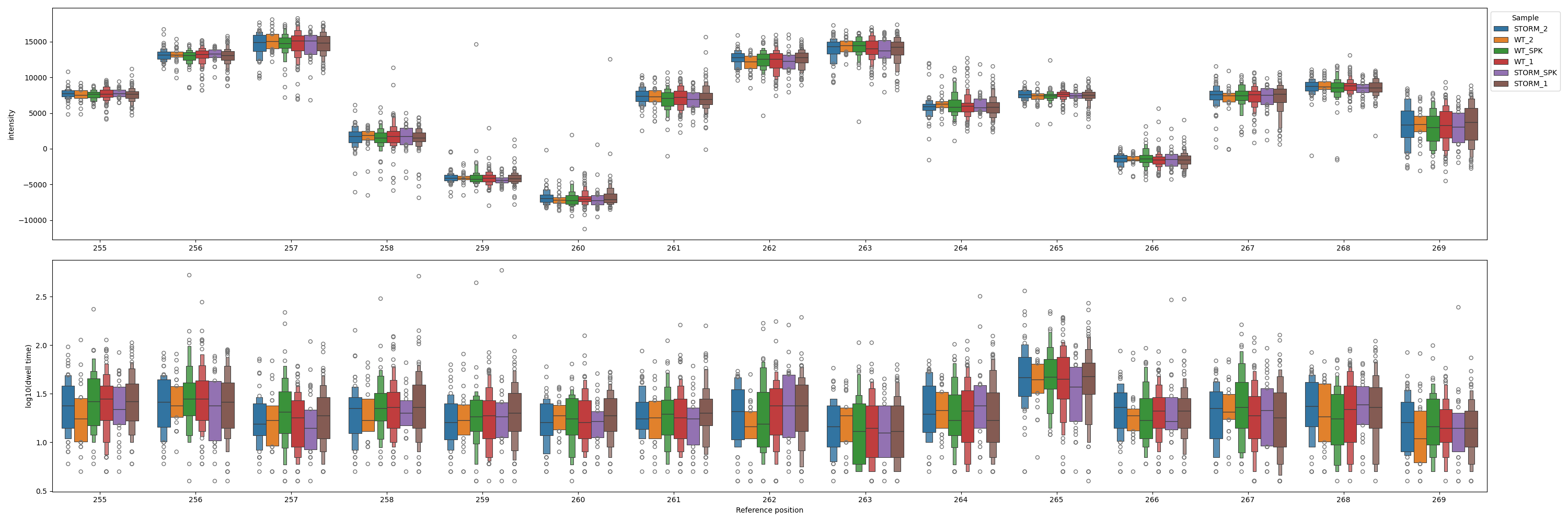
signal
Command: nanocompore plot signal
Plots the signal measurements from the input data files listed in the configuration. Note: this will show all input data without performing the filtering and downsampling that are during the execution of the Nanocompore run command.
positional arguments:
  reference             Reference name, matching a name from the FASTA reference used in the config.

options:
  -h, --help            show this help message and exit
  --config CONFIG, -c CONFIG
                        Path to the input configuration YAML file.
  --output OUTPUT, -o OUTPUT
                        Path and filename where the plot will be saved.
  --start START         0-based index on the reference.
  --end END             0-based index on the reference.
  --kind {violinplot,swarmplot,boxenplot}
                        Kind of plot to draw. Default: violinplot
  --figsize FIGSIZE     Figure size: WIDTH,HEIGHT. Default: 30,10
  --split_samples       Split results by sample instead of by condition.
  --markersize MARKERSIZE
                        Size of the points if swarmplot is used.
  --palette PALETTE     Color palette to use. Default: Dark2
Palettes can be picked from the standard matplotlib colormaps: https://matplotlib.org/stable/users/explain/colors/colormaps.html
Example plot:
One can also change the kind of plot and split by sample instead of condition:
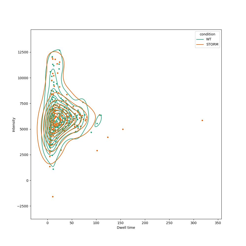
position
Command: nanocompore plot position
Plot the signal data for a specific position as a 2D plot. Note: this will plot the data as it is in the input files, without applying the filtering performed by Nanocompore.
positional arguments:
  reference             Reference name, matching a name from the FASTA reference used in the config.
  position              Position to plot (0-based index).

options:
  -h, --help            show this help message and exit
  --config CONFIG, -c CONFIG
                        Path to the input configuration YAML file.
  --output OUTPUT, -o OUTPUT
                        Path and filename where the plot will be saved.
  --figsize FIGSIZE     Figure size: WIDTH,HEIGHT. Default: 10,10
  --point_size POINT_SIZE
                        Size of the data points
  --xlim XLIM           Set specific range for the x-axis: MIN,MAX. By default it will be inferred from the data
  --ylim YLIM           Set specific range for the x-axis: MIN,MAX. By default it will be inferred from the data
  --kde                 Plot the KDE of the intensity/dwell bivarariate distributions in the two samples.
  --kde_levels KDE_LEVELS
                        How many levels of the gaussian distributions to show
  --palette PALETTE     Use a single palette to select both point and gmm colors.
Palettes can be picked from the standard matplotlib colormaps: https://matplotlib.org/stable/users/explain/colors/colormaps.html
Example plot:
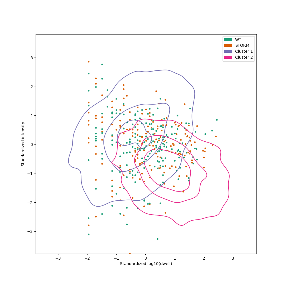
gmm
Command: nanocompore plot gmm
Plot the GMM fitting for a position. This replicates all data filtering and produces identical GMM fitting to the one obtained by the run command. The resulting parameters for the two Gaussian distributions are used to sample points and plot their KDEs. Note that this is different from the position plot where we show the KDEs of the input data, not the fitted Gaussians.
positional arguments:
  reference             Reference name, matching a name from the FASTA reference used in the config.
  position              Position to plot (0-based index).

options:
  -h, --help            show this help message and exit
  --config CONFIG, -c CONFIG
                        Path to the input configuration YAML file.
  --output OUTPUT, -o OUTPUT
                        Path and filename where the plot will be saved.
  --figsize FIGSIZE     Figure size: WIDTH,HEIGHT. Default: 10,10
  --point_size POINT_SIZE
                        Size of the data points
  --xlim XLIM           Set specific range for the x-axis: MIN,MAX. By default it will be inferred from the data
  --ylim YLIM           Set specific range for the x-axis: MIN,MAX. By default it will be inferred from the data
  --gmm_levels GMM_LEVELS
                        How many levels of the gaussian distributions to show
  --palette PALETTE     Use a single palette to select both point and gmm colors.
  --point_palette POINT_PALETTE
                        Which palette to use for plotting the points.
  --gmm_palette GMM_PALETTE
                        Which palette to use for plotting the gaussian distributions.
Palettes can be picked from the standard matplotlib colormaps: https://matplotlib.org/stable/users/explain/colors/colormaps.html
Example plot:
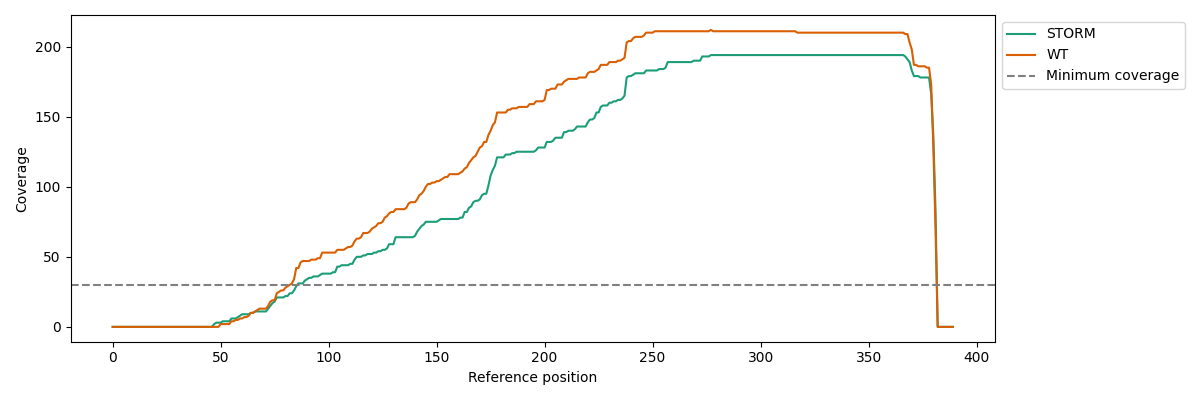
coverage
Command: nanocompore plot gmm
Plot the read coverage for a region.
positional arguments:
  reference             Reference name, matching a name from the FASTA reference used in the config.

options:
  -h, --help            show this help message and exit
  --config CONFIG, -c CONFIG
                        Path to the input configuration YAML file.
  --output OUTPUT, -o OUTPUT
                        Path and filename where the plot will be saved.
  --start START         0-based index on the reference.
  --end END             0-based index on the reference.
  --figsize FIGSIZE     Figure size: WIDTH,HEIGHT. Default: 30,10
  --split_samples       Split results by sample instead of by condition.
  --palette PALETTE     Use a single palette to select both point and gmm colors.
Palettes can be picked from the standard matplotlib colormaps: https://matplotlib.org/stable/users/explain/colors/colormaps.html
Example plot: